WasteWatch.Make preventable waste visible to the people who can act.
WasteWatch records what gets thrown away with enough context to do something about it — item, reason, recipe, person, device — then costs it, separates preventable from unavoidable, and shows what it is doing to your food cost.
Every screen below was captured from the running platform with a demo organisation — not drawn as a mockup. The labels, columns and tiles are the ones your team would work in.
01
One event table everything else is computed from
The waste log is the grain of the whole module — every other screen is an aggregation of it, and the module says so. Each row carries the item, quantity, cost, reason, recipe, employee, device and location, so a number on the overview can always be traced back to the events that made it.
Columns run Date, Time, Item, Category, Qty, Cost, Reason, Recipe, Employee, Device and Location
Reason codes cover Spoiled, Expired, Wilted, Day-old, Over-portioned, Damaged, Trim, Prep error and Other
Filter by category, employee, device, recipe or reason, or search item, recipe and employee free-text
Opening a row shows the linked ProcurePulse ingredient, supplier and batch where the connection exists
app.vyso.co.za/wastewatch/log
02
What it cost, and how much of it was avoidable
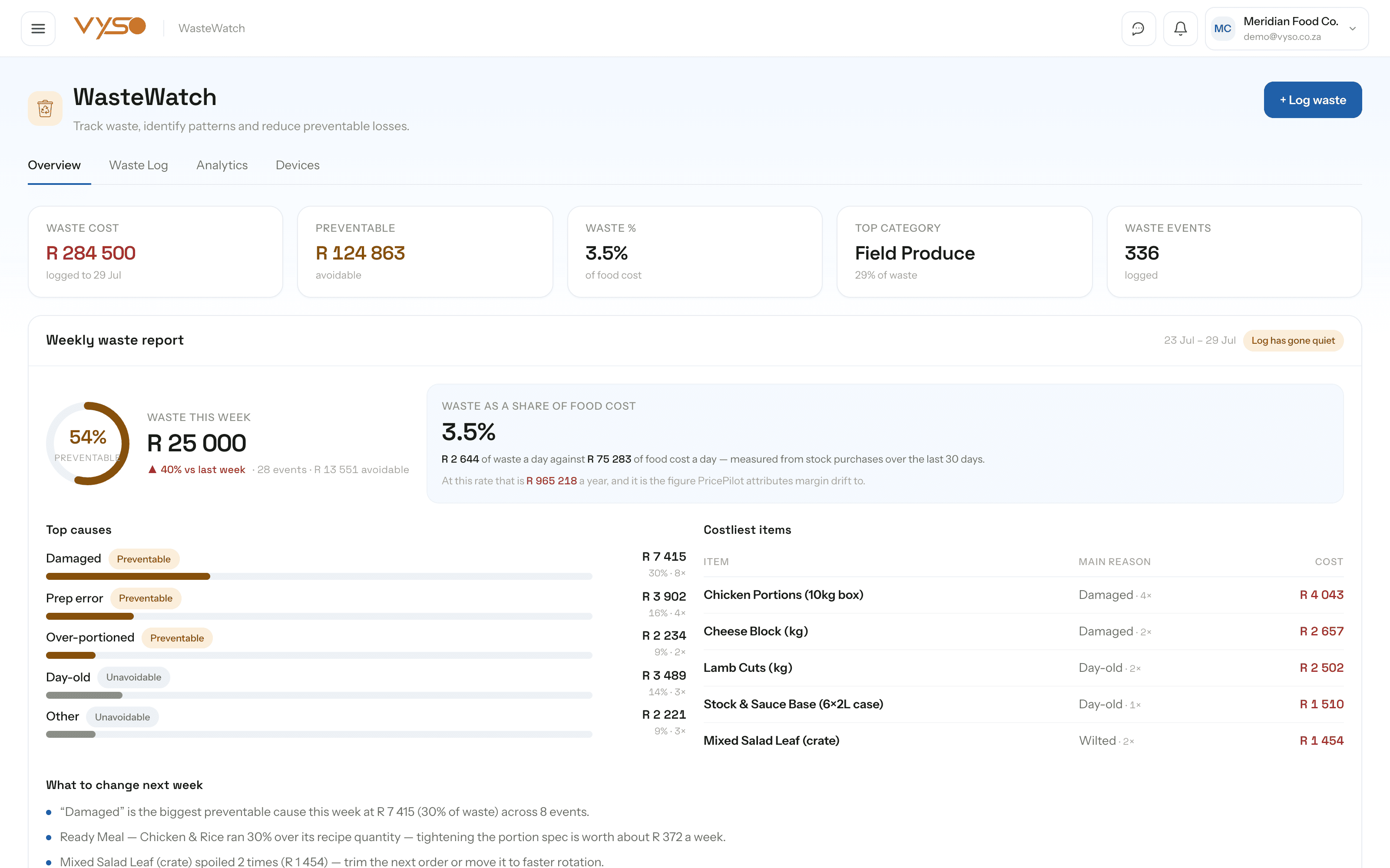
A waste total on its own tends to produce a shrug. The overview splits the number: what it cost, how much was preventable, and what it represents as a share of food cost — with a plain-language list of what to change next week rather than a chart to interpret.
KPI tiles cover Waste cost, Preventable, Waste % of food cost, Top category and Waste events
The weekly report ranks top causes with a preventable or unavoidable badge, and lists costliest items with their main reason
Top waste sources are clickable category tiles that filter the log to that category
A cost timeline runs across today, week, month, quarter and year, captioned when the curve is illustrative rather than yours
03
Patterns, not just totals
Waste is rarely random — it clusters on a service, a recipe, a weekday. Analytics breaks the log down by category, reason, recipe, person and time so the conversation moves from “we're wasting too much” to “Saturday dinner over-portions this dish”.
“Over-portioning by recipe” compares expected against actual quantity with the excess cost and the number of events
Day-of-week bars stack preventable against unavoidable per weekday, with a written callout naming the worst day
A service-period heatmap crosses Morning, Lunch and Dinner against weekdays, and says outright when it is illustrative
Categories are yours to create, rename, recolour or remove — and totals are recomputed from the log on every load
app.vyso.co.za/wastewatch/analytics
04
Coaching that doesn't blame people for the weather
Per-person waste data is easy to misuse, so the coaching view is built to exclude natural spoilage on purpose — nobody is flagged for produce that arrived past its best. What remains is preventable waste, with a tone badge and a written note per person rather than a leaderboard.
Coaching cards are scoped to preventable waste only, and say so on the panel
Tone badges run Doing well, Worth a refresher and Keep an eye — framed as support, not discipline
A separate waste-by-employee ranking shows cost, event count and the trend against the team average
Preventable versus unavoidable is shown as its own split, so the ratio is visible before any individual is
05
Scales and stations, ready for automatic capture
Typing waste in is the reason waste logs die. The Devices tab is the register for the scales, sensors and stations that will weigh it instead — device, type, location, status, battery, last sync, current user and current recipe — with the hardware capture path still being wired up rather than quietly implied.
The add-device wizard covers Bluetooth, bench, floor and kitchen scales, IoT sensors, barcode and camera stations
Device detail shows firmware, calibration state, live measurements and history, with the operator linked through to ShiftBoard
Automatic capture from a paired scale is in progress; manual logging is the working path today
app.vyso.co.za/wastewatch/devices
How it fits your week
The routine, not the feature list.
Software only helps if it changes what someone actually does on a Tuesday. This is the working rhythm WasteWatch is built around.
1
Log it where it happens
“+ Log waste” sits on every tab. Item, quantity, unit, category, cost, reason and optionally the recipe — a few seconds, close to the moment, rather than a reconstruction on Friday.
2
Read the weekly report on Monday
What it cost, what share was preventable, which categories and items drove it, and a written list of what to change this week.
3
Fix the recipe, not the person
Over-portioning is measured against each recipe's expected quantity, so the correction is usually a portion size or a prep method.
4
Have the coaching conversation with data
Preventable waste only, tone-badged per person, with spoilage excluded — a support conversation rather than an accusation.
5
Watch it land in the margin
Waste as a share of food cost is the figure margin analysis attributes drift to, and a week-on-week waste spike raises a cross-module anomaly.
Works with the rest of Vyso
Connected where the workflow needs it.
These are real data relationships, not a logo wall. Each one describes what actually moves between WasteWatch and the module beside it.
Including the parts that are still on the roadmap. You should be able to plan around what exists today, not around a promise.
Do staff have to type everything in, or does it connect to scales?
Both paths are in the product, but only one is finished. Manual logging works today. The Devices tab already registers and monitors paired scales and stations, while automatic weigh-and-log capture is still being wired up — the app says so rather than implying otherwise.
How does it know what was preventable and what was just spoilage?
Every event carries a reason code. Over-portioned, prep error and damaged are treated as preventable; spoilage and expiry are not — and the coaching view deliberately excludes the unavoidable half so nobody is flagged for produce that arrived past its best.
Does this actually connect to our margin numbers?
Yes. Waste as a share of food cost is computed against real purchase data, or against sales and your target margin where purchase data is thin — and it is the figure the pricing module attributes margin drift to.
Will it flag a problem, or do we have to go looking?
InsightGen carries a waste-spike rule: if 7-day waste cost runs a set percentage above the previous seven days, it surfaces as a cross-module anomaly with the rule that fired it printed on the card.
Can we set our own waste categories?
Yes. Categories are yours to create, rename, recolour and remove from the Analytics tab. Categories that appeared from the log itself are marked as such, and every total is recomputed from the log so the tabs always agree.